Ayrlooms Antiques Identity
Identity system conceptualized and created for my mother's antique business. She runs multiple antique booths in Western Michigan under the name "Ayrlooms" and crafted a wooden sign as a logo to display in store. Upon expanding her business online, she wanted an updated logo that utilized elements from her sign, but translated better digitally. Created in Adobe Illustrator.

The Challenge
Working for a client who is also an artist! My mother is a floral designer and interior decorator with very high standards and that scared me more than the fact that she was my mom. Pertaining to the art, it was a challenge transferring a physical object into a digital rendition that is both a compositional improvement, but still does justice to its' origins.


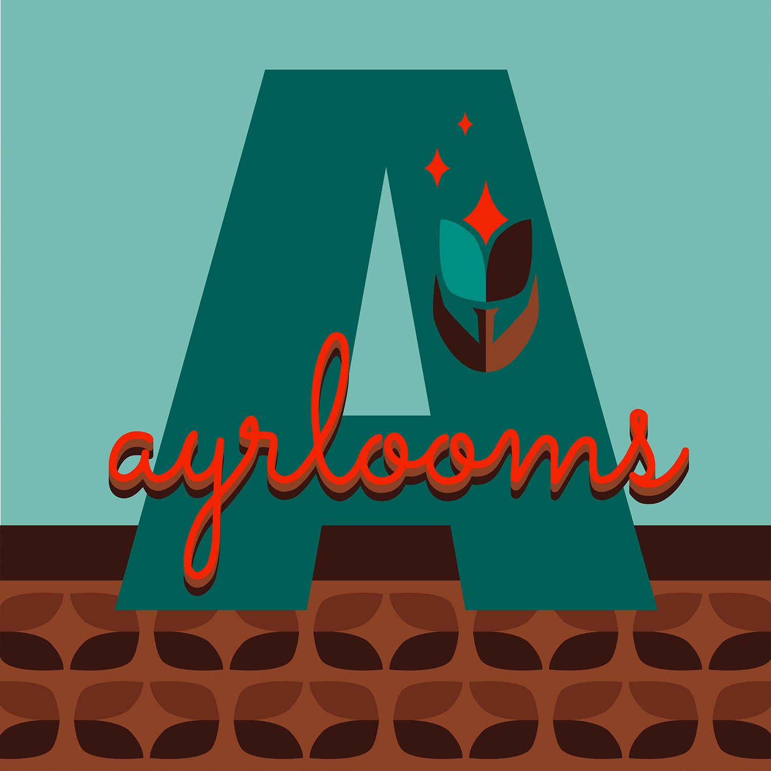
Image Descriptions
First: Photo of my mother's physical Antique Booth, located at Harvest Antiques & Collectibles in Holland, Michigan. My mom has been collecting antiques and fine art from garage and estate sales in the greater Chicagoland area since the 90's and upon moving to a vacation town, found a market for her pieces. Though selling antiques from many time periods, her focus is Midcentury, and she needed her logo to reflect that.
Second: Color palette for the logo. The client wanted earth tones, or shades of orange and blue to be used. These colors fell naturally into place before constructing the logo, because I grabbed swatches directly from her sign and only tweaked them slightly so the background didn't overpower the letter, taking away legibility.
Third: Logo references used, some provided by the client and some from my research. My mother wanted an illustrative symbol of a flower somewhere in her logo, but no direction was provided for the look because she "trusted me". I first started designing symbols to look like the wire in her sign, but quickly nixed that idea because it would have left the composition unbalanced and too zoomed out to still read as an icon. Final graphic influenced by Dutch art and color-blocking techniques, but also design from the Midcentury era, mainly wallpaper graphics.
Fourth: Photo of the wooden sign sitting at the helm of my mom's booth that she crafted from wood and bent wire. The "A" is a pre-cut wood form that she painted a pattern on to compliment the design of the ribbon. She did such a good job at first I was pulling references for logos adapted from signs and did a trace of her sign in Illustrator. Ultimately we decided on a square format and an actual font, but this was a more than viable option because of my mother's keen design sense.
Fifth: The logo itself. I broke it down into 3 seperate pieces during the design process to better refine ideas because I was given such an ambiguous objective. First I rendered the shape of the "A", which is almost exactly the dimensions of the "A" on my mother's sign, just tweaked for composition. Next I rendered the type after the client didn't like any of the fonts chosen and wanted something that looked more like it could be made of wire, but cleaner. After having those 2 elements locking in the composition and knowing the pattern would take up the lower 1/3rd of the canvas, I started on the illustrations. The pattern was easy because it's the shape of my tulip leaves made into a geometric arrangement. I played around with a few iterations before I was satisfied that I captured the vibe of sitting on a Herman Miller chair with a highball glass in someone's knotty pine basement. More important than a successful design, my mom loves it, and being able to help someone visually enhance their vision is the best feeling.